
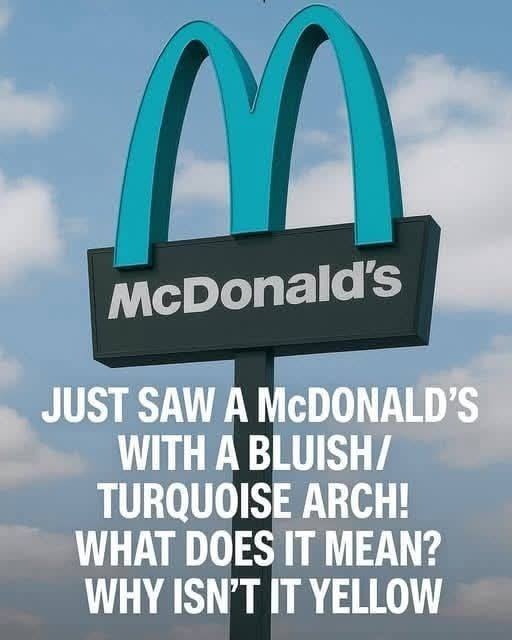
Yellow, which stands out brightly in urban settings, was viewed as too disruptive for Sedona’s earthy palette. Local leaders wanted to prevent any commercial feature from overshadowing the dramatic natural views that define the community.
After discussions, McDonald’s and the city reached a compromise: the arches could stay, but not in gold. Turquoise, a color that blended more gently with the environment while still remaining distinctive, was chosen as the alternative.
What began as a practical solution soon became a local icon. Tourists visiting Sedona’s famous trails and vistas started stopping by the McDonald’s simply to photograph the unusual arches, turning the restaurant into a quirky attraction of its own.
This adaptation shows how global brands can respect local values without losing their identity. By altering only the color, McDonald’s preserved both its recognizable symbol and Sedona’s commitment to visual harmony.
Today, the turquoise arches are more than a sign for fast food—they are part of Sedona’s story, reflecting a place willing to stand apart and embrace thoughtful compromise.
ADVERTISEMENT
